The Psychology of Road Signs
A surprising amount of research has gone into designing road signs in such a way that the average driver will react to them almost unconsciously. Though road signs may seem somewhat arbitrary, they reflect a deep understanding of how our brains recognize and interpret imagery.
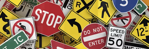
Shapes Speed up Interpretation
There’s a reason you haven’t ever seen a rectangular stop sign. Designating specific shapes for signs based on their meaning, and the consistency of that designation, allows us to interpret certain signs without even reading them. If you see a red octagon in your peripheral, you know what to do. A rectangular sign, however, would confuse at first glance.
Colors Cause an Emotional Response
A green stop sign sends the brain a mixed message. Color in general evokes an emotional reaction, whether you realize it or not. For example, our brains are hardwired to interpret the color red as a threat, due to an unconscious association with blood. That’s why red signs often indicate a dangerous situation ahead. “WRONG WAY”, “DO NOT ENTER”, and “STOP” are all red signs that denote a potential conflict point with other vehicles.
Symbols Speak to Your Subconscious
Symbols convey information much more quickly than words because symbol interpretation is done in part by your subconscious mind. Signs containing images of stick figures in action are particularly effective. We tend to find human-like images more relatable and empathize with them on some level. Studies have found that school crossing signs with images of stick-figure children grab a driver’s attention almost a full second earlier than signs with text alone.
Words Efficiently Convey Information
It may seem like the drastically condensed language on some road signs is the result of a sign designer running out of space on the canvas, but these shortcuts are actually in place to help slow readers absorb the information faster. The same goes for abbreviations such as “XING” and “FWY”. Capitalization is also very deliberate because depending on how it's used, it can aid in legibility.
Even the choice of font can make a difference. In 2004, the standard font for road signs was changed to Clearview, from the previously used font Highway Gothic. However, in 2016 it was changed back to Highway Gothic after it was discovered that the increased height difference between capital and small letters in the Highway Gothic font makes it more legible in low visibility conditions.